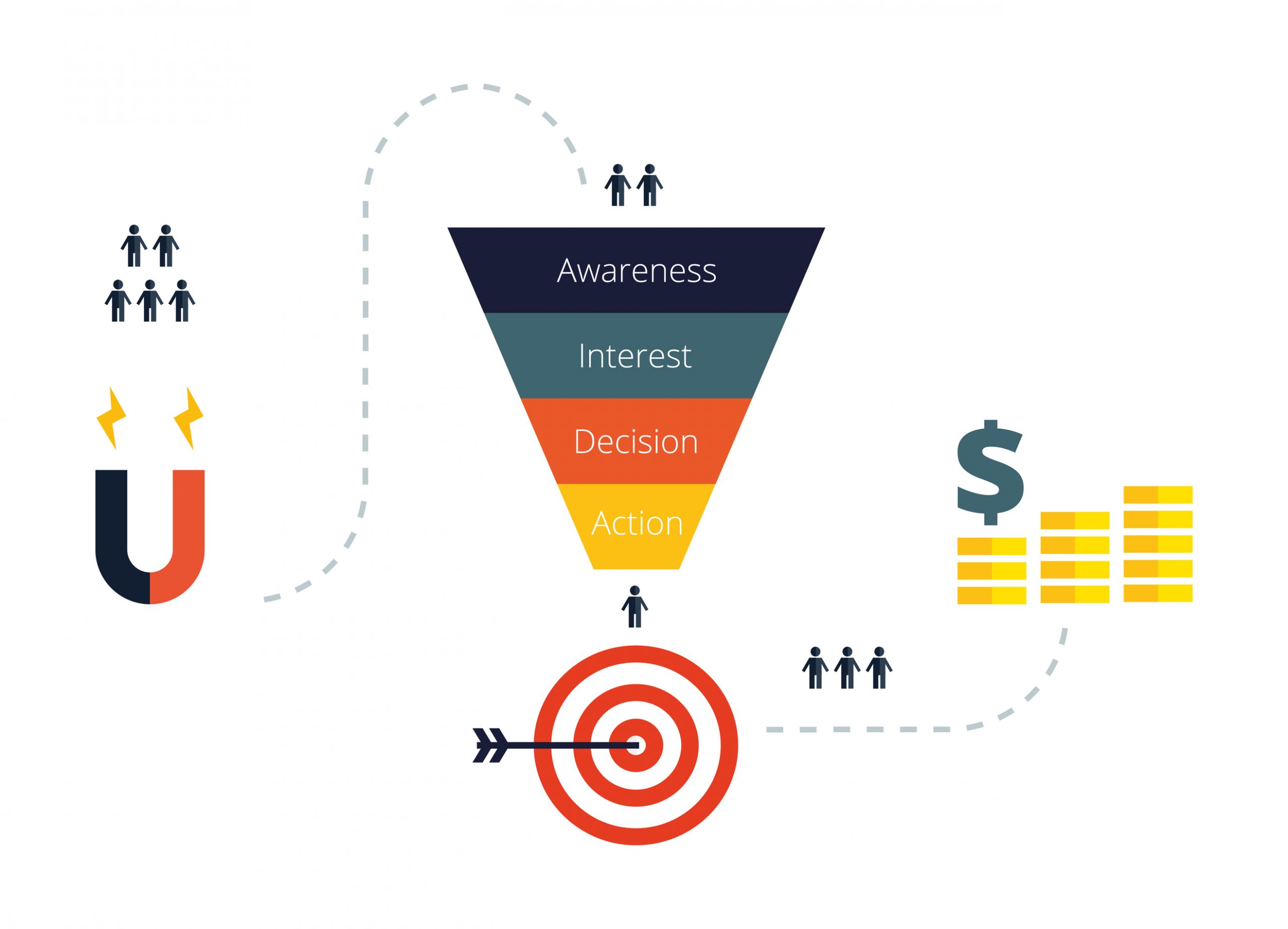
Conversion matters! – that’s what we are told constantly and rightfully so. Conversion rate is a measure of the percentage of people visiting my business becoming actual customers. So, conversion rates basically show how effective you are at pursuing your customers and building an effective relationship with them.
Conversion rates are far more important to online businesses compared to traditional brick and mortar stores. The competition is intense in the ecommerce world and missed opportunities add up.
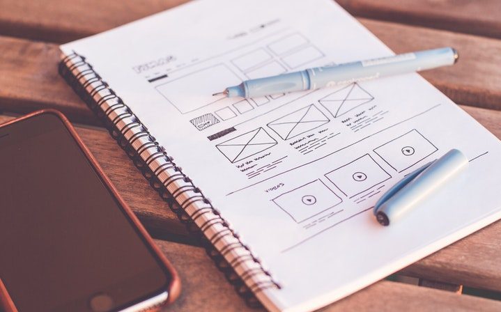
There are a number of small things to do to improve the chances of conversion. One of the most important optimization you need to perform is with the landing page of your store or website. It is the first interaction your visitor has with your business and it is the first impression created in their minds. I cannot stress enough the importance of a good landing page.
There are many different things that go into creating a great landing page with content that captures the visitor’s attention enough for them to want to learn more. Let’s break some of that down.
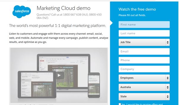
The first thing anyone with a website wants to do, is catch eyeballs. To do so, you must have headlines that “pop”. We’re in an age today where people scroll past thousands of ads a day. We are so immune to being sold stuff that when we actually go on a website to look for a product or service, even then our attention span and threshold for excitement is so high. Research has shown that the average consumer has an attention span of about 3 seconds. To gain that attention, the first, and most important factor in a successful landing page is a headline that really “pops” to the audience. Wow them. Shock them. Mystify them. Whatever it takes to gain their precious interest.
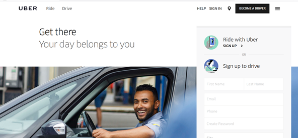
After gaining that initial interest, you must keep their interest piqued with quality introductions that are creative, clear and concise. This, as well as some other key important information should be kept above the fold. Remember, attention spans are short. As much info you can keep above the fold (without stuffing too much in), the better.
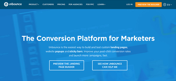
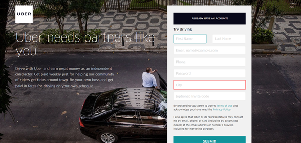
Once you have got your visitors attention, it is time to get some meaningful engagement. Here is where the Call to Action (CTA) button comes in. CTA buttons are anything on the page that asks the visitor to click and move to the next stage, examples include the ‘buy now’ or ‘learn more’ button.
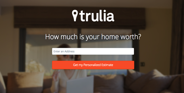
CTA buttons are important and few things need to be kept in mind while designing a good one for your website. Firstly and most importantly, your CTA button should stand out. Make sure it is visible; the button should be good size and have contrasting colours with the page it is on. You could consider adding a little 3D effect to the button so that it looks more clickable.

Placement is crucial and I would suggest you do a little research into UI and UX before deciding on where to put the CTA button. Studying UX can give you perspective on how a person navigates through a webpage and help you with the placement decision.
The text on the CTA button is just as important as the placement of it. Make sure what your write is brief, clear and interesting. You can try being a little creative but a generic ‘buy now’ or ‘learn more’ also work as case studies suggest. What you can do to stand out is add a little visual clue like a small icon.
Another important component of a highly converting landing page is visual contents. Human are visual animals. We are attracted to beautiful images. Therefore, always use high quality images and videos to grab users’ attention.
The last few steps aren’t as fun or glamorous, but are extremely important nonetheless. Website designers employ A/B or A/B/C testing. A/B testing is basically using different variations of various elements on the webpage and tracking the results using different tools to identify the better performer. As an example, you can use a certain colour on the CTA button for a week or two and track the results. The next step is to use a different colour and track that result too. Ultimately use the better performer. A/B testing should be performed for all elements on the webpage such as headings, text, images, colour schemes, page layouts, CTA buttons, links etc.
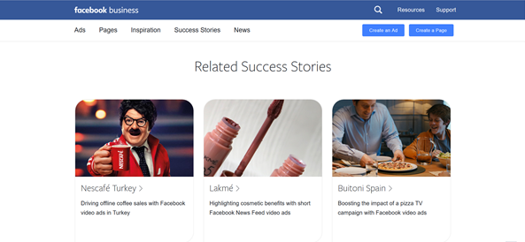
The last step in creating a great landing page is success stories and testimonials. Many people underestimate this part as well, and unfortunately so. Visitors to a website are looking for a proven track record and someone they can trust. By reading your success stories and testimonials, this gives them a certain peace of mind that you aren’t “newbies” who lack experience and expertise. Get creative. Embellish. But make sure you have some quality content in this section.
Related Blog Post